前言

  • 最近在做手机端的页面,制作过程出现了flex布局的一些问题,再次记录在解决办法
  • 关于在flex:1的情况下设置为width的效果
    • 如果没有设置width,当内部元素的内容大小超过平均分配的剩余空间时,元素的宽度等于内容大小,如果设置了width并且这个width的大小小于平均分配的剩余空间大小时,取平均分配的剩余空间;当flex设置为 1 时 相当于 剩余空间大小 = 父元素的宽度 因此平均的剩余空间大小等于 = 父元素的宽度 / 元素的个数,直接设置width为0可以保证元素宽度平分父元素宽度

    • 说简单点就是设置了flex:1的情况下不设置width:0,那么就会导致父元素宽度等于等元素的宽度,而不会等于剩下空间的长度,这样子就会超出空间了

    • 具体可看@地址

    • 顺带一提,在苹果机器上,可能会出现window.innerHeight或者window.innerWidth获取不到或者是获取到的不是自己想要的高度或宽度,那是因为这二个属性在苹果safari上获取的是视觉视口,而不是布局视口,尽管现在布局视口等于视觉视口了,所以保险起见,还是使用document.document.clientHeight来获取可视区域的高度

最终效果

  • 可以看到,完成了基本布局和超出显示省略号的功能

开始

  • 有时候我就感觉很奇怪,为什么有的用margin,有的用padding,后面才知道,margin是透明的,填充不会被填充到,padding则会被填充

  • 开启flex在主内容区域,并设置每一个item项目高度为80px

  • 稍加完善就成为了这样子,注意,此时还没有设置超出显示省略号的效果
  • 此时的代码
1
2
3
4
5
6
7
8
9
10
11
12
13
14
15
16
17
18
19
20
21
22
23
24
25
26
27
28
29
30
31
32
33
34
35
36
37
38
39
40
41
42
43
44
45
46
47
48
49
50
51
52
53
*{
margin: 0;
padding: 0;
}
:root{
--self-top:50px;
--self-bottom:40px;
--self-leftTab:60px;
}
.wrapper{
width: 100%;
//顶部,一般是搜索栏
.top{
height: var(--self-top);
background-color: red;
}
.main{
display: flex;
flex-flow: row nowrap;
background-color: gray;
//计算剩余高度,当然,后期计算可能需要通过js来手动计算
height: calc(100% - var(--self-top) - var(--self-bottom));
// 左侧,一般是分栏,用于切换不同栏目,一般是固定的宽度
.main-left{
width: var(--self-leftTab);
background-color: aquamarine;
}

//右侧,一般是数据展示,才用flex布局一般,手机不用flex布局是否可用
.main-right{
display: flex;
flex-flow: column wrap;
flex: 1;//让其子元素占满
//每一个的item项目
&-item{
height: 80px;//假设为80px
background-color: brown;
margin-bottom: 10px;
/* 假设这是一个描述信息 */
&_description{
white-space: nowrap;
text-overflow:ellipsis;
overflow: hidden;
}
}
}
}
/* 底部一般是底部导航,一般会固定高度 */
.bottom{
height:var(--self-bottom);
background-color: hotpink;
}
}
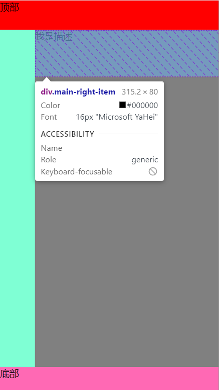
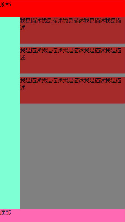
  • 这样子写看上去没有什么问题,但是如果item项的描述信息过多的时候,就会导致下面动图演示的问题了
    • 可以看到,随着超人字段的增加,左侧tab栏被挤压了
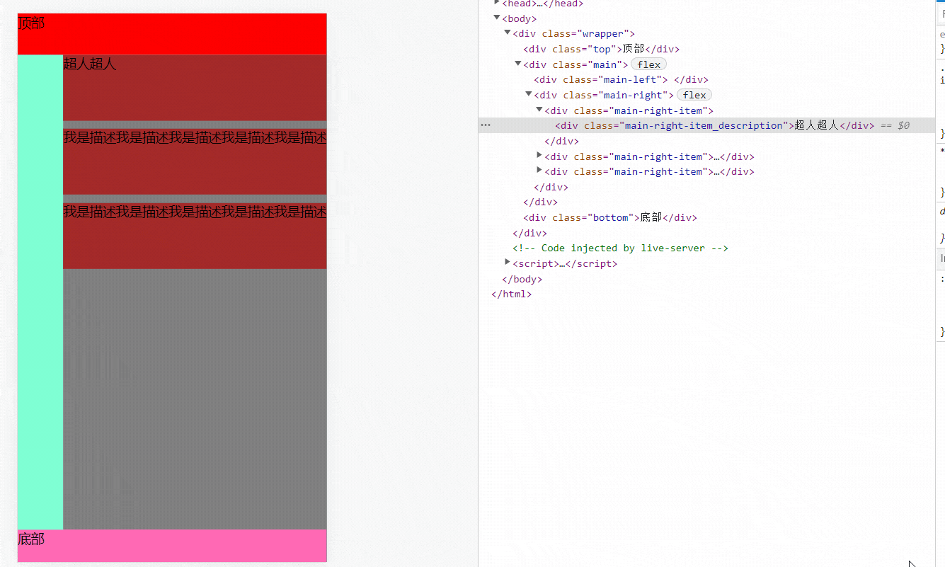
  • 这个时候只需要设置类名为main-right的div宽度为0即可(也就是设置item项的外层div容器宽度为0),就恢复正常了
1
2
3
4
5
6
7
8
9
.main-right{
display: flex;
flex-flow: column wrap;
flex: 1;
width: 0; //重点,避免挤压其他的
&-item{
.....
}
}
恢复正常了
  • 但是依旧没有省略号,那是因为没有约束每一个item项的宽度,导致item项的宽度会被子元素撑开,这里约束下就好
1
2
3
4
5
6
7
8
9
10
11
12
 .main-right{
display: flex;
flex-flow: column wrap;
flex: 1;
width: 0;//避免挤压左侧tab栏
&-item{
//....
//设置item的宽度为父元素100%
//避免被挤压
width: 100%;
}
}
  • 完成

完整代码

  • html代码
1
2
3
4
5
6
7
8
9
10
11
12
13
14
15
16
17
18
19
20
21
22
23
24
25
26
27
28
29
30
31
32
33
<html lang="en">
<head>
<meta charset="UTF-8">
<meta http-equiv="X-UA-Compatible" content="IE=edge">
<meta name="viewport" content="width=device-width, initial-scale=1.0">
<title>Document</title>
<link rel="stylesheet" href="./1.css">
</head>
<body>
<div class="wrapper">
<div class="top">顶部</div>

<div class="main">
<div class="main-left">

</div>
<div class="main-right">
<div class="main-right-item">
<div class="main-right-item_description">我是描述我是描述我是描述我是描述我是描述我是描述我是描述我是描述我是描述我是描述我是描述我是描述我是描述我是描述我是描述</div>
</div>
<div class="main-right-item">
<div class="main-right-item_description">我是描述我是描述我是描述我是描述我是描述</div>
</div>
<div class="main-right-item">
<div class="main-right-item_description">我是描述我是描述我是描述我是描述我是描述</div>
</div>
</div>
</div>

<div class="bottom">底部</div>
</div>
</body>
</html>
  • less代码
1
2
3
4
5
6
7
8
9
10
11
12
13
14
15
16
17
18
19
20
21
22
23
24
25
26
27
28
29
30
31
32
33
34
35
36
37
38
39
40
41
42
43
44
45
46
47
48
49
50
51
52
53
54
55
*{
margin: 0;
padding: 0;
}
:root{
--self-top:50px;
--self-bottom:40px;
--self-leftTab:60px;
}
.wrapper{
width: 100%;
//顶部,一般是搜索栏
.top{
height: var(--self-top);
background-color: red;
}
.main{
display: flex;
flex-flow: row nowrap;
background-color: gray;
//计算剩余高度,当然,后期计算可能需要通过js来手动计算
height: calc(100% - var(--self-top) - var(--self-bottom));
// 左侧,一般是分栏,用于切换不同栏目,一般是固定的宽度
.main-left{
width: var(--self-leftTab);
background-color: aquamarine;
}

//右侧,一般是数据展示,才用flex布局一般,手机不用flex布局是否可用
.main-right{
display: flex;
flex-flow: column wrap;
flex: 1;//让其子元素占满
width: 0;
//每一个的item项目
&-item{
height: 80px;//假设为80px
background-color: brown;
margin-bottom: 10px;
width: 100%;
/* 假设这是一个描述信息 */
&_description{
white-space: nowrap;
text-overflow:ellipsis;
overflow: hidden;
}
}
}
}
/* 底部一般是底部导航,一般会固定高度 */
.bottom{
height:var(--self-bottom);
background-color: hotpink;
}
}
  • less编译后的css代码
1
2
3
4
5
6
7
8
9
10
11
12
13
14
15
16
17
18
19
20
21
22
23
24
25
26
27
28
29
30
31
32
33
34
35
36
37
38
39
40
41
42
43
44
45
46
47
48
49
50
* {
margin: 0;
padding: 0;
}
:root {
--self-top: 50px;
--self-bottom: 40px;
--self-leftTab: 60px;
}
.wrapper {
width: 100%;
/* 底部一般是底部导航,一般会固定高度 */
}
.wrapper .top {
height: var(--self-top);
background-color: red;
}
.wrapper .main {
display: flex;
flex-flow: row nowrap;
background-color: gray;
height: calc(100% - var(--self-top) - var(--self-bottom));
}
.wrapper .main .main-left {
width: var(--self-leftTab);
background-color: aquamarine;
}
.wrapper .main .main-right {
display: flex;
flex-flow: column wrap;
flex: 1;
width: 0;
}
.wrapper .main .main-right-item {
height: 80px;
background-color: brown;
margin-bottom: 10px;
width: 100%;
/* 假设这是一个描述信息 */
}
.wrapper .main .main-right-item_description {
white-space: nowrap;
text-overflow: ellipsis;
overflow: hidden;
}
.wrapper .bottom {
height: var(--self-bottom);
background-color: hotpink;
}
/*# sourceMappingURL=./1.css.map */