
使用backdrop-filter实现elementui官网的模糊滤镜效果的和毛玻璃效果
前置
- element-ui官网有一个属性很好看,可以看到,当滚动的时候,文字会被显示白色带阴影背景
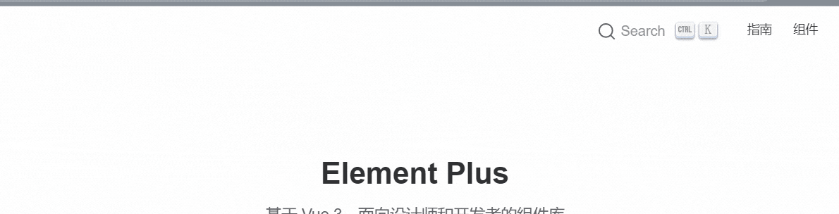
- 你可能有点印象,因为公交车的时候也是类似于这种效果
- 他们是怎么做的呢?我看到源码使用到了
backdrop-filterbackground-sizebackground-image- 就实现了,很少的属性,达到了不错的效果,值得学习
element-ui开始
了解backdrop-filter和filter属性
backdrop-filter属性
- 可以让你为一个元素后面区域添加图形效果(如模糊或颜色偏移)。因为它适用于元素背后的所有元素,为了看到效果,必须使元素或其背景至少部分透明。
- 说通俗点就是通过设置A上面的B元素来达到对A模糊或颜色偏移的效果
filter属性
- 将模糊或颜色偏移等图形效果应用于元素。滤镜通常用于调整图像、背景和边框的渲染。
二者区别
backdrop-filter作用于元素的背景(不直接作用于元素,而是通过另外一层元素来达到效果)- 作用于元素背后的所有元素
filter直接设置在元素身上- 作用于当前元素,并且它的后代元素也会继承这个属性
二者支持的滤镜对比(其实filter可以用的,backdrop-filter都可以用)
| filter | backdrop-filter | 备注 | |
|---|---|---|---|
| url | √ | √ | 获取指向SVG过滤器的URI |
| blur(模糊) | √ | √ | 高斯模糊滤镜 |
| brightness(亮度) | √ | √ | 图像明亮度的滤镜 |
| contrast(对比度) | √ | √ | 图像的对比度滤镜 |
| drop-shadow(阴影) | √ | √ | 图像的阴影滤镜 |
| grayscale(灰度) | √ | √ | 图像灰度滤镜 |
| hue-rotate(色相旋转) | √ | √ | 图像色相滤镜 |
| invert(反色) | √ | √ | 反转滤镜 |
| opacity(透明度) | √ | √ | 透明度滤镜 |
| sepia | √ | √ | 深褐色滤镜 |
| saturate(褐色) | √ | √ | 图像饱和度滤镜 |
- element-ui头部栏就是通过设置
blur和saturate属性来达到的
一步步分解
- 找到官网,复制粘贴代码(以将变量全部转化为具体的值)
1 | .navbar-wrapper { |
- 我们重点关注下面几个属性
background-image: radial-gradient(transparent 1px,#ffffff 1px);background-size: 4px 4px;backdrop-filter: saturate(50%) blur(4px);
为什么设置background-size和background-image
background-size:设置背景图片大小,这个不用多说background-image设置背景图片的大小所以我们如果只设置这二个值会发生什么?为了便于观看,我将
background-image换为了一张具体图片,便于查看
1 | <html lang="en"> |
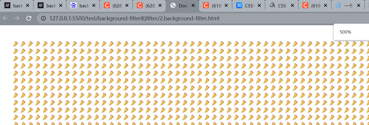
初次的时候你可能看到这个效果

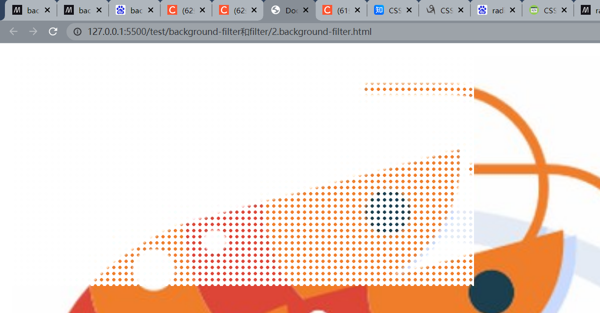
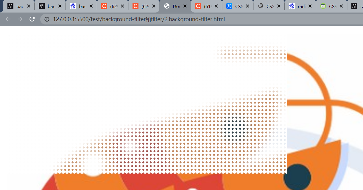
是不是觉得这个点点是什么,我们放大看看
- 原来是一个一个的背景图,因为我们设置了
background-size尺寸,然后默认背景会铺满全部的,所以就导致这效果
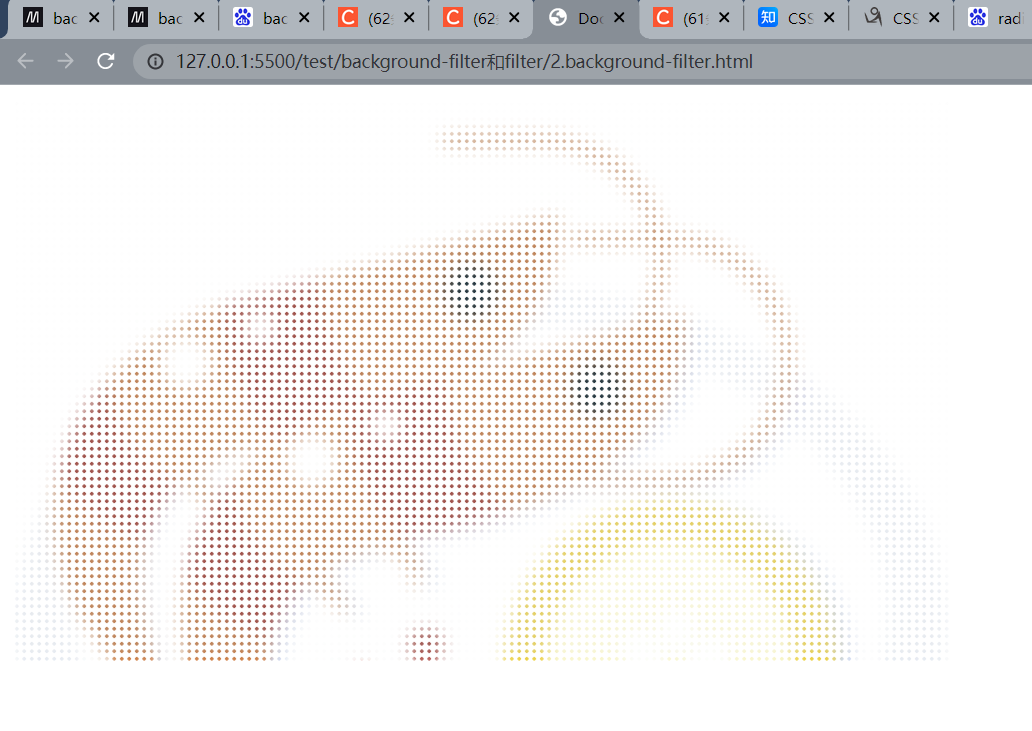
- 现在我们讲
background-size和background-image换为element-ui上的属性,看看会发生什么
1 | .content { |
- 可以看到,只不过背景被替换为了一个一个的小渐变圆点
最终
- 我们最后添加上
backdrop-filter样式
1 | <html lang="en"> |
你可以对比看看,添加backdrop-filter在这里也就多了一层朦胧的效果
你也可以扩大一点,使得A身上的B元素和A一样宽度,就成了下面这种效果
1 | <html lang="en"> |
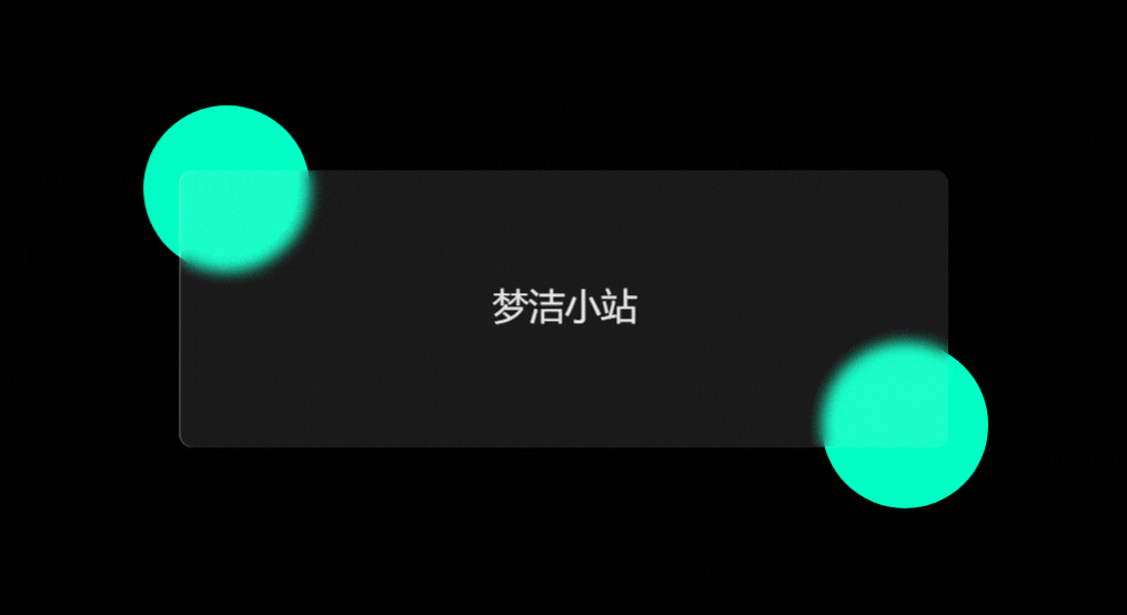
毛玻璃效果
- 可以看到,下面这张gif实现了一个很漂亮的gif,那么做的呢?也是通过
backdrop-filter来实现的,由于找不到这张图就源代码,就自己写了下~ - 在线地址@地址

最终完成效果
先编写一个静态页面
1 | <html lang="en"> |
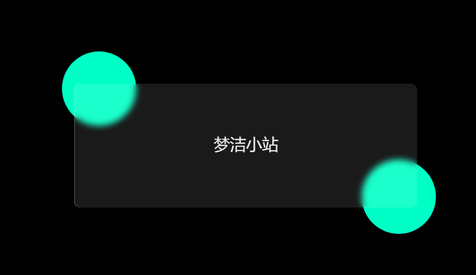
添加一点动画
1 | <html lang="en"> |
完成效果
本博客所有文章除特别声明外,均采用 CC BY-NC-SA 4.0 许可协议。转载请注明来自 梦洁小站-属于你我的小天地!
相关推荐


评论
